Creative + Fun
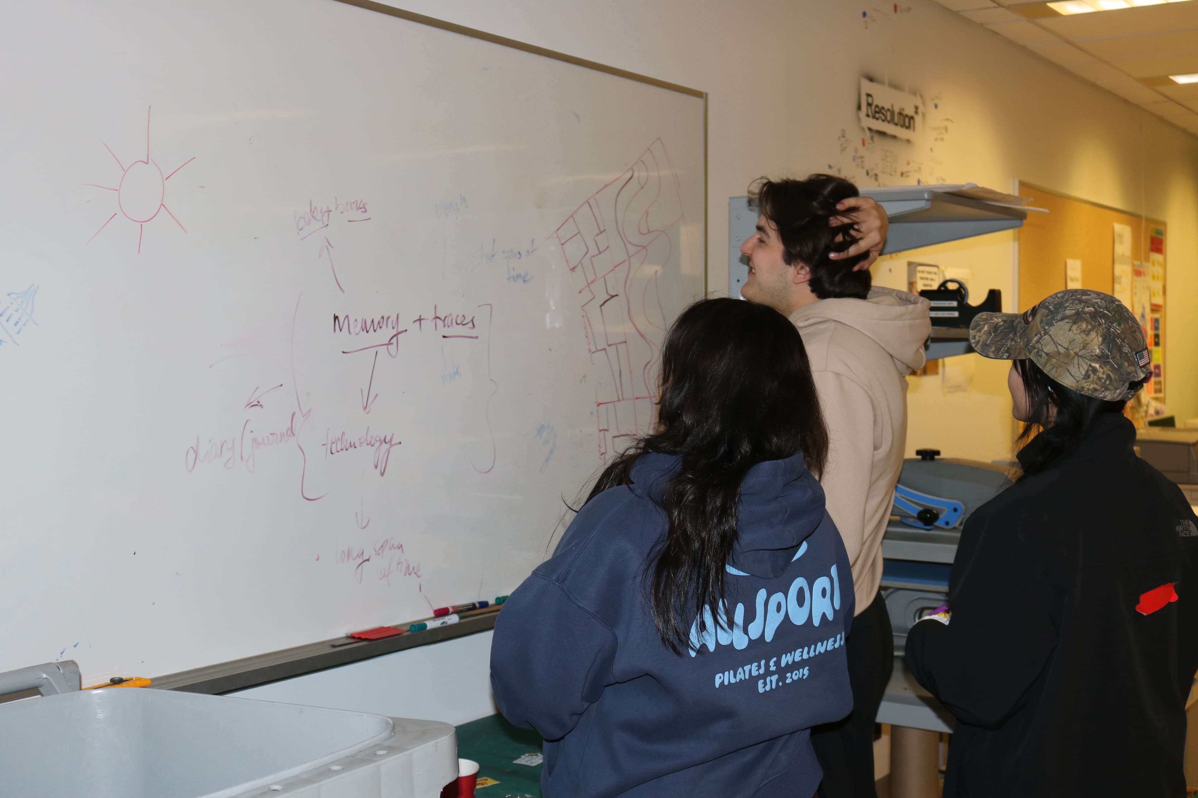
DSA represents our unique student culture and community, creating welcoming spaces and initiatives that encourage active student engagement.
With a sudden team change leaving the DSA without a new brand identity a week before launch, I took the initiative and task to create a full visual identity, narrative, and design system from scratch.
I did a branding project with the mind of a product designer.

Design Student Association 2026 - 2027 Rebrand
Overview
The DSA is a student-led association for students in the Design at York University to interact, learn and grow by providing the resources and skills to bridge the gap between the academic and industry and/or professional fields in the interest of students' post-graduation careers.
Every year, the Design Students’ Association (DSA) launches a brand-new visual identity to reflect that specific student executive team and era. The Design Students’ Association operates as a two-sided platform connecting two audiences with opposing needs and mental models:
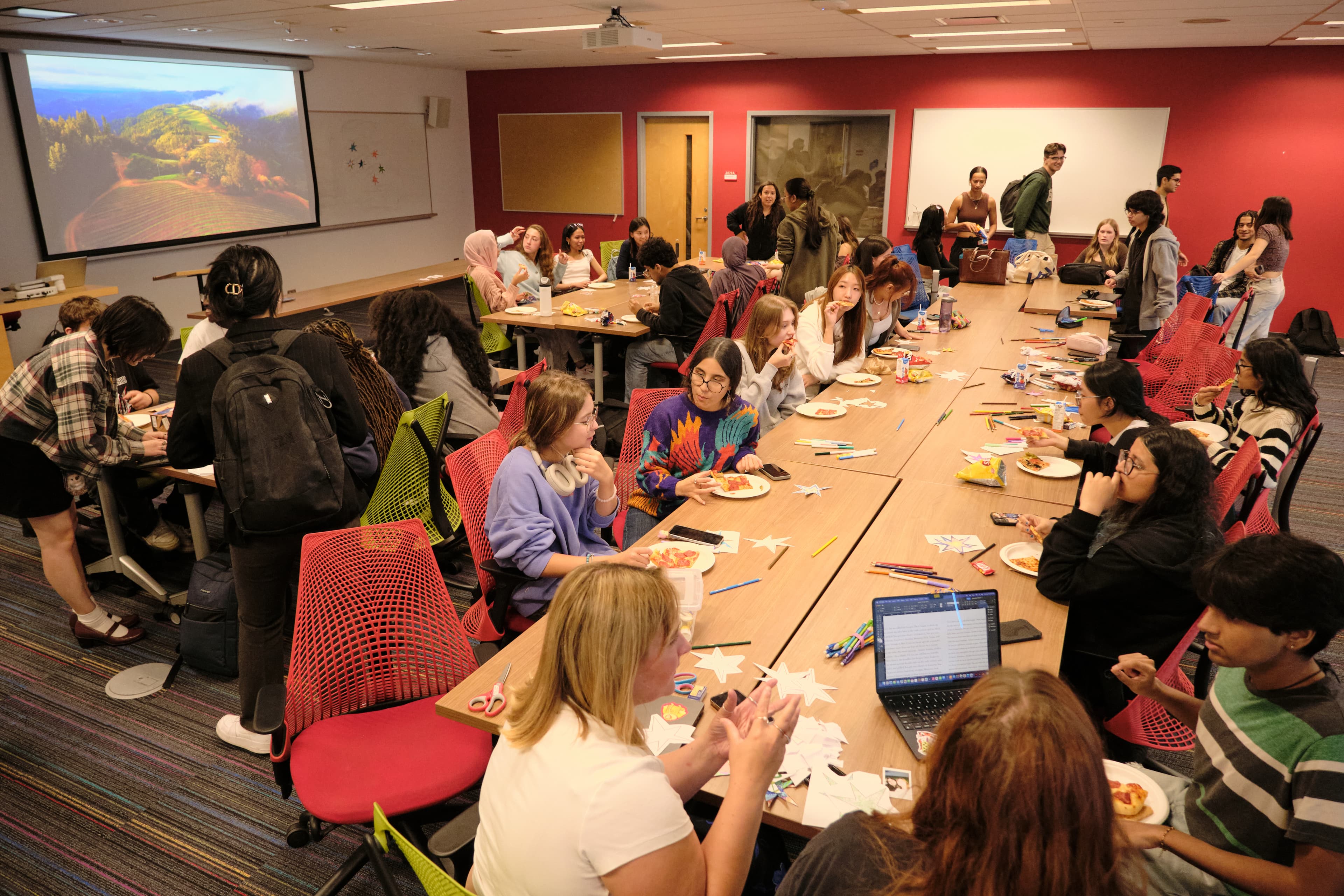
The Student Design Community
Design students of all years seeking community, skill-building, and relief from academic pressure.
Goals:
Likes:
Needs:
The Industry
Recruiters, design leaders, agency partners, studios, and corporate sponsors looking for emerging talent.
Goals:
Likes:
Needs:
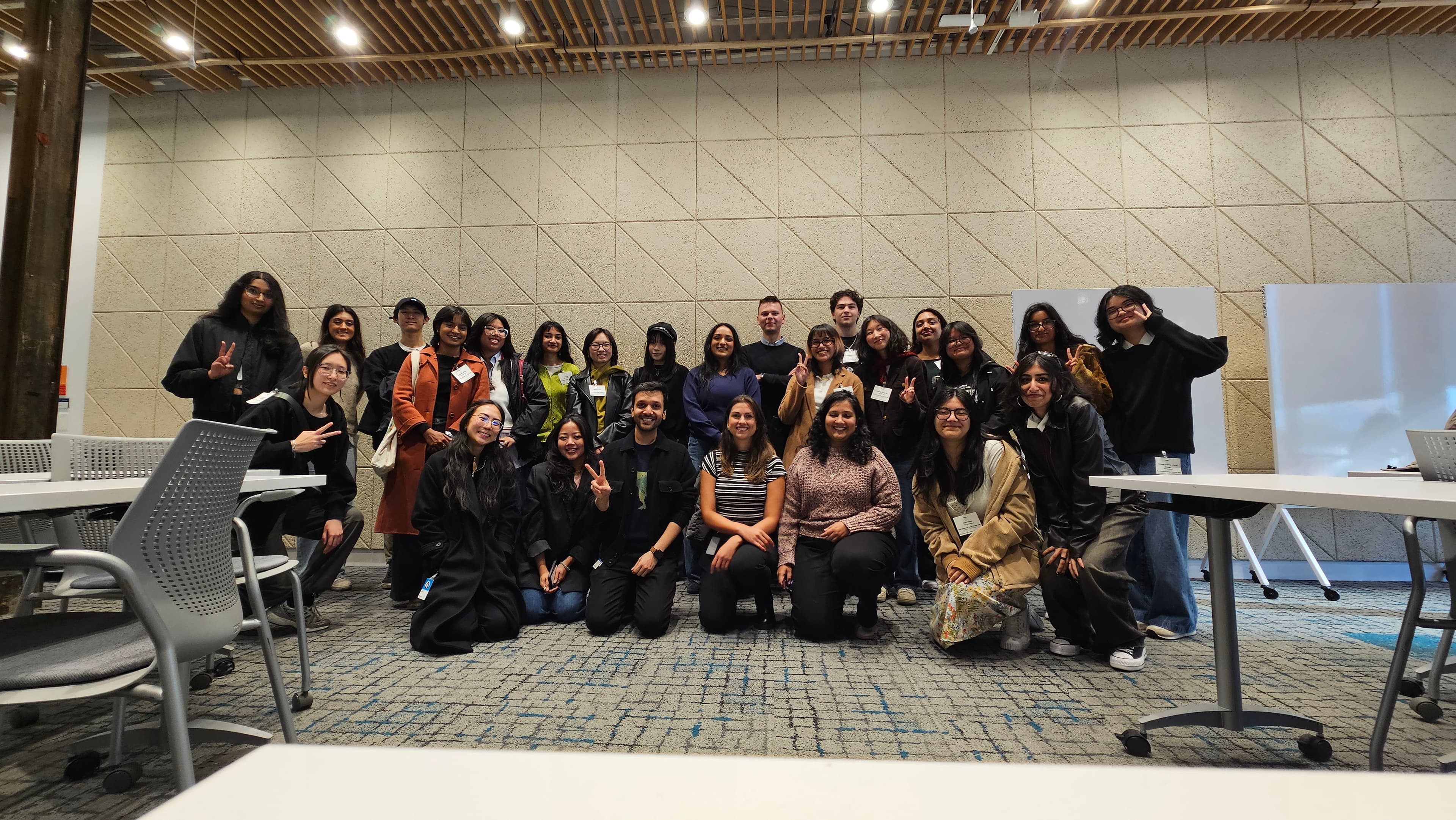
DSA represents our unique student culture and community, creating welcoming spaces and initiatives that encourage active student engagement.
Mentorship and Events will actively pursue new partnership opportunities, connecting with student clubs, industry professionals, and creative studios to expand our network.
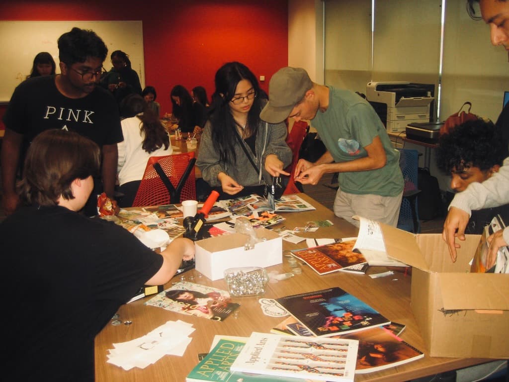
DSA will be pushing more events. Because we are new to the game, we need to leave a lasting impression to build long-term partnerships and keep the club growing.
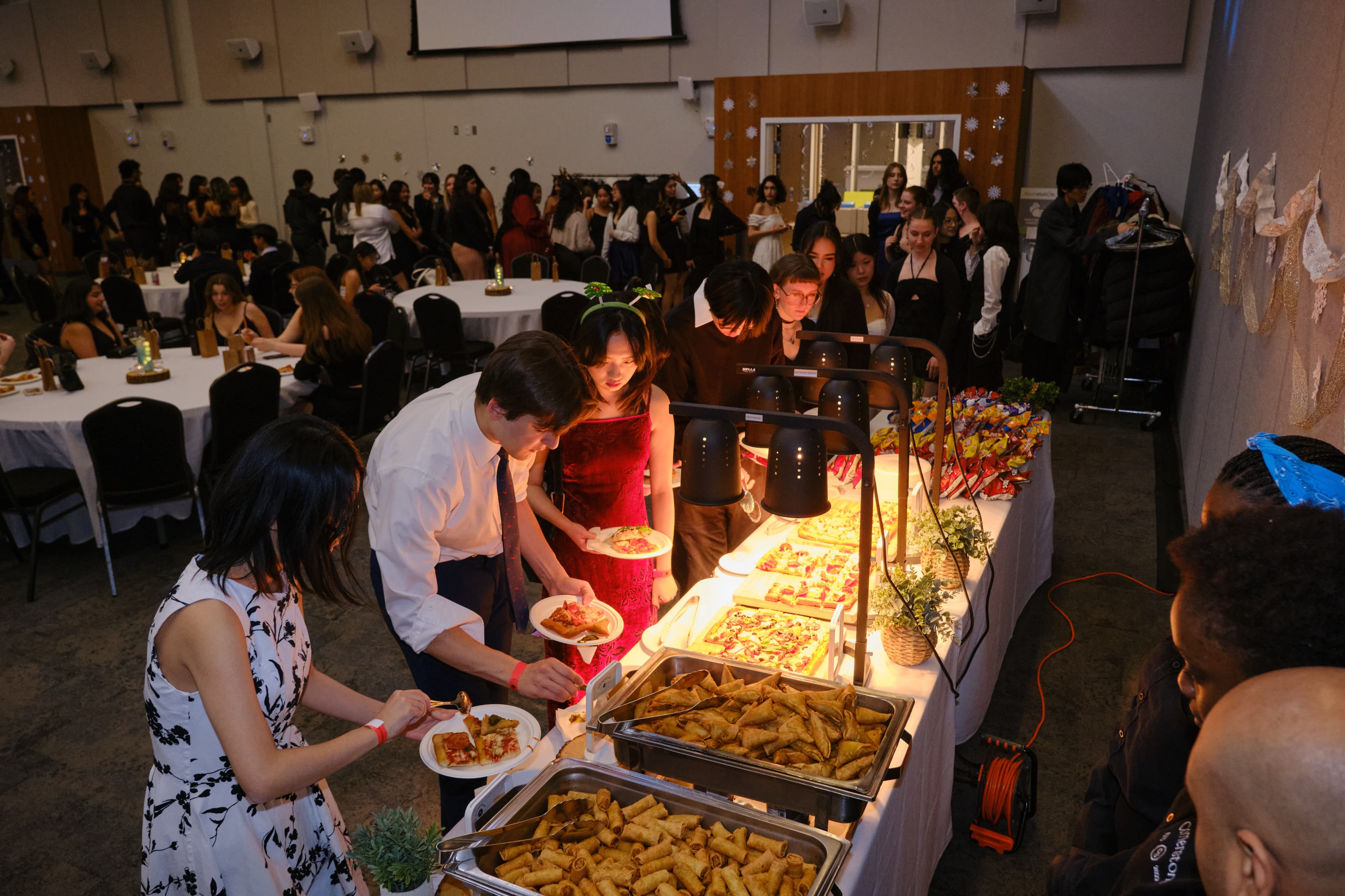
Design Thinking
My concept for this year is to bring back the fun and nostalgia of design by reviving iconic elements from past DSA brands (starting with the physically connected logo from 2010) and systematizing them into a fresh, expressive visual identity for the 2026/2027 year. As well as using colours and icons to help remind people why they got into design in the first place!
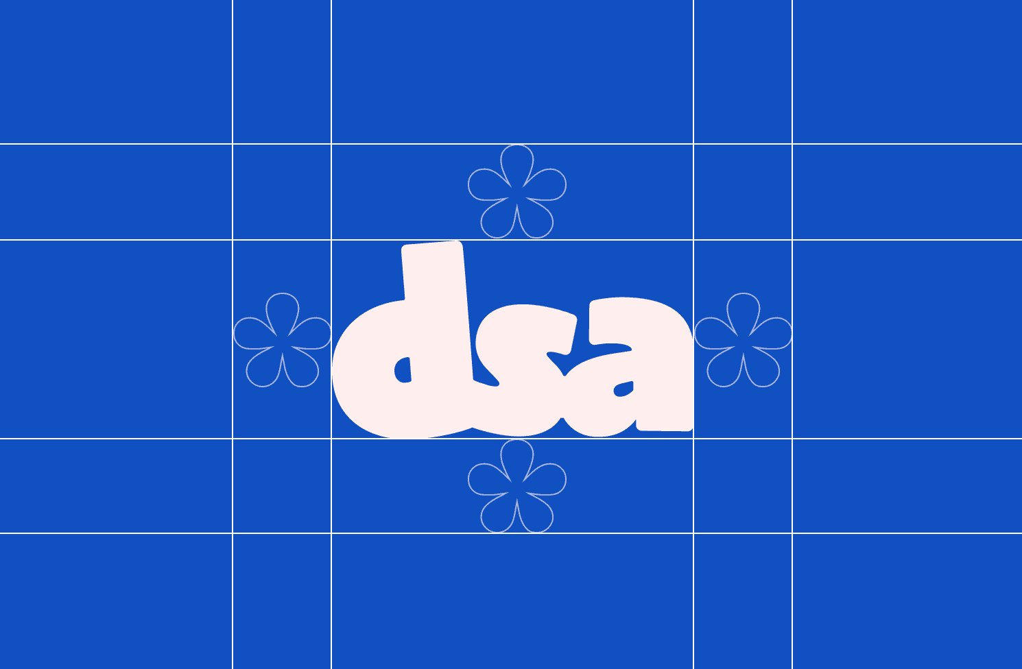
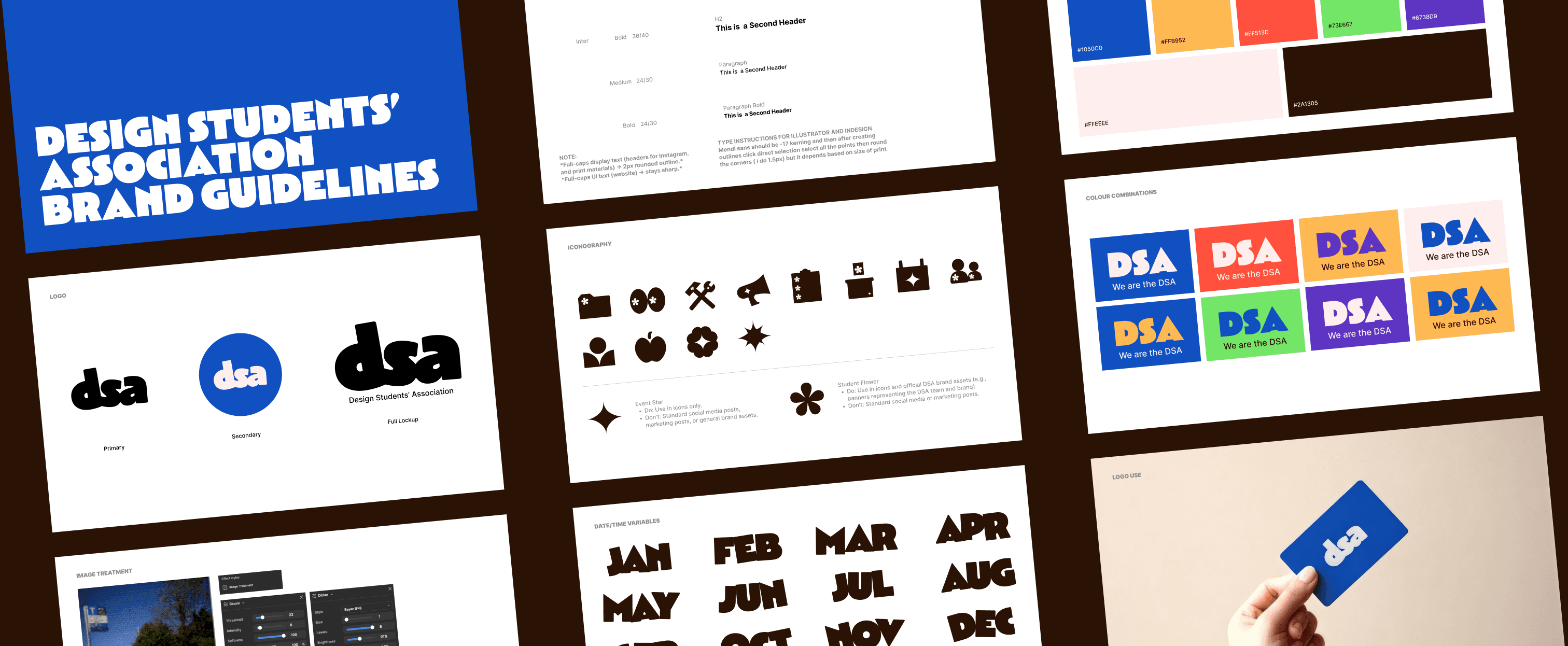
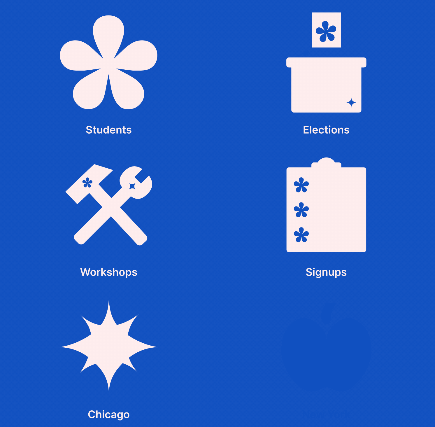
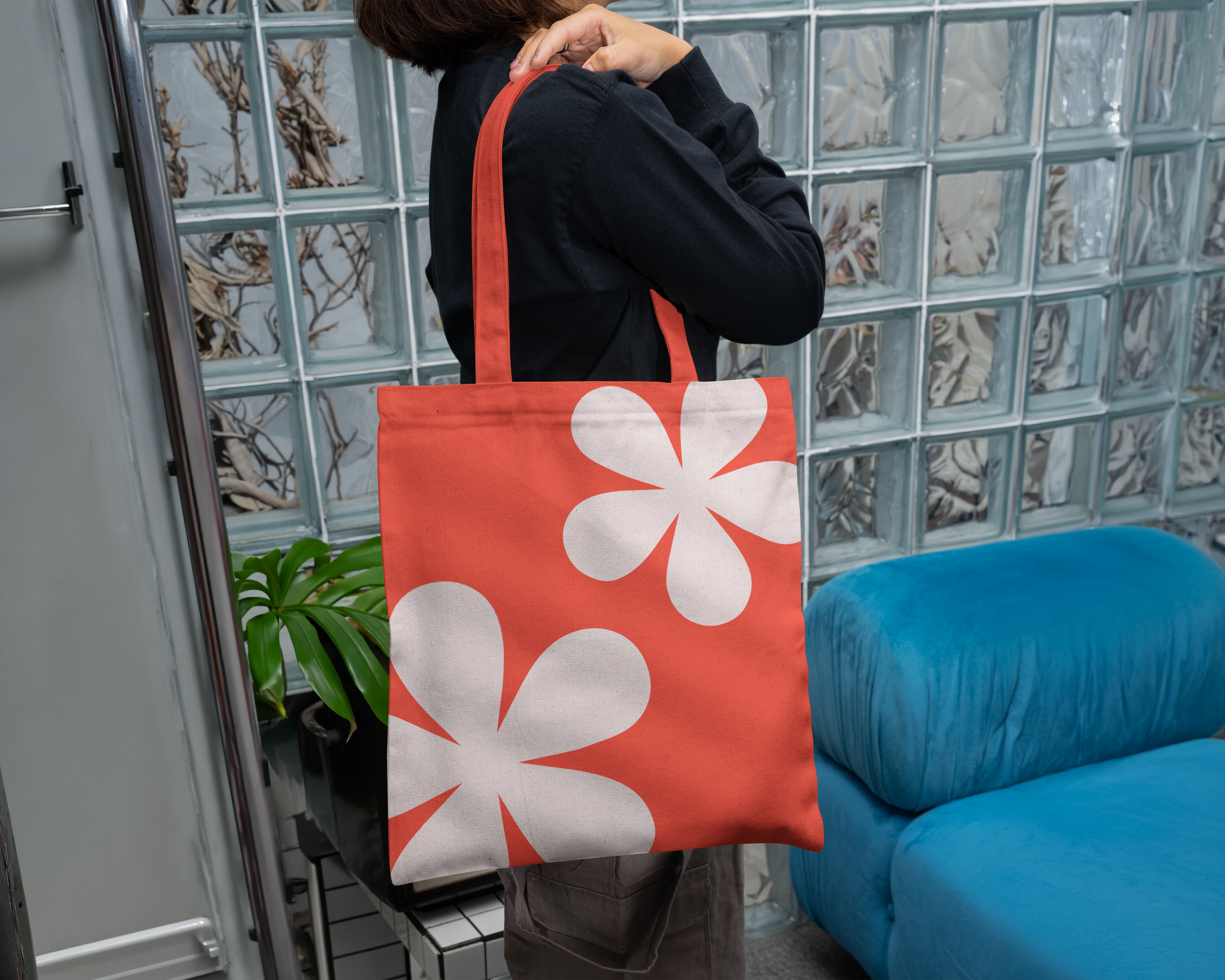
One of the biggest things was that instead of inventing abstract, disconnected motifs for this year’s rebrand, I looked back at the evolution of DSA’s visual history and decided to create an icon system. The flower represents students, and the 4-point star represents events (especially since we started using Luma this year).
When we first start out as kids, design is pure experimentation and fun. As we get older, we slowly become leashed to the strict guidelines provided in studios or corporate companies. Students in design programs especially face a lot of imposter syndrome and lack of motivation because someone you know is always better than you.
I wanted to lean into nostalgic reminders like the bright primary colours, custom (fun) icons and the warm retro colour harmonies. Creating a visual identity where people feel like it’s a safe space to experiment and fail. I wanted to bring the fun and passion back to design, which a lot of students experience throughout their journey.
At the end of the day, we’re still students, not industry professionals (yet).
DSA hasn’t used a physically connected wordmark since 2010. For this year’s brand identity, I restored the connected ribbon geometry as a literal symbol of community, legacy, and bridging students to industry.
Underneath the playful surface, I created a strict grid system, accessible colour tokens, and clean UI mechanics to prove our work is grounded in modern design standards and is moving the DSA towards the future.

Brand System
Nostalgic Playfulness
Systematic Use
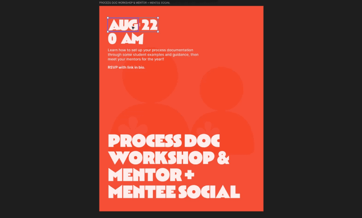
Reusable tokens and modular kits turn layout creation into a fast drag-and-drop workflow. Cutting doen time taken to create posts by 80%.
Reflections
I’ve been apart of the DSA since my first-year and to accidentally have the chance to define our first-impression to people was an honour. I’m so happy with how this brand came out I was worried we would get stuck in a very rigid corporate brand going forward and I’m happy to be able to show that we’re still learning